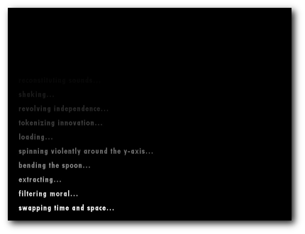
Players expect loading times, and recognise that they are a necessary evil. It’s a given that most, if not all games, will have them. Since a loading screen is encountered by the player multiple times, it’s important to think about their experience when they encounter these screens, as it will undoubtedly form part of their impression of your game. This is often forgotten by developers.
Games are leisure activities, and so it’s important to make sure that the player’s impression is positive at all times. Today we’ll be looking at some good ways that developers have handled loading screens, and some failed attempts that have caused players to complain, or turn off games completely, and coming up with guidelines on how to design a good loading screen.

Please wait for the rest of this post...
Good loading screens
Loading screens don’t have to have lead to a bad player experience, and as proved by:
Call of Duty: Modern Warfare 2
Call of Duty doesn’t have loading screens. It has briefings. While the game loads, COD:MW2 uses this necessary ‘lull’ in game play to forward the story, and give the player a description of the back story for the next level. The effect of this on the player is that, instead of being booted out and told them “wait here for more fun”, the player is given the opportunity to continue interacting with the game.
When I played COD:MW2, I had no idea what the story was, or what was going on. But the briefings distracted me enough from the loading screens that I didn’t care, and didn’t notice I was being kept waiting for the next part of the game.
Ridge Racer
What about games that don’t have stories? Ridge Racer, for the PSX, gave you a mini-game to play while the game loaded (Arcade classic Galaxian I believe), hence keeping the player entertained. Namco have repeated this successful formula in other games, such as the Tekken series. Simply giving the player something to do while they wait can mean the difference between a player who gets frustrated and gives up, and one who continues playing.
Bad loading screens
However, some games make fatal mistakes when it comes to loading screens, which detract from the player experience:

Remember me?
Resident Evil
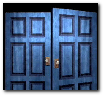
Most people’s memories of the early Resident Evils include the door animations (link to youtube). Every time you exited a room, there would be a short pause, and the same ‘loading’ animation. Every time. No wonder people remember, and got sick of them. Although initially covering the pause that the system needed to load the next room, eventually they just became a ‘feature’, as evident in Resident Evil Nemesis, where the boss character breaks down some doors, effectively destroying the loading times between the joining rooms. The danger of boring a player by forcing them to sit through a repetitive animation is a lesson not yet learnt, as evident in Penny Arcade’s comic on Mass Effect
Sim City 2000
2 minutes to load the start screen? Another loading time after you’ve selected to load an existing game, or start a new one? This may be a technical issue, but superfluous loading screens are going to immediately detract from the player experience
How to make a great loading screen
Loading screens have improved a lot in the past 10 years, and some features of good loading screens are common to many games. To make a good loading screen, consider including some of the following:
- Include tips/facts/story on the loading screens. Instead of just saying ‘loading’ on the loading screen, think of what the player may want to know. Is there a special technique in the game that you could tell the player about? Is there some background story you want to impart? This downtime is ideal for letting them know
- Hide the loading process where possible. Tony Hawk’s Unleashed claimed to have no loading times. It did, but the player never saw them, as it loaded the next level seamlessly as the player passed through some adjoining rooms. By never taking control away from the player, the player doesn’t have to know that the game is loading in the background.
- If you do have to have a loading screen, make sure you keep usability heuristics in mind, and make the loading progress transparent. Show the progress of the load (really show it, not just an infinitely spinning wheel!), so the player doesn’t have to wonder how long they will be waiting, or worse, if its frozen.
- If you’re Namco, put a mini game on the loading screen. If you’re not, I believe Namco have copyrighted this. So better not.
By thinking about a holistic player experience, including the menu system, and loading screens, as opposed to just considering the gameplay, you can improve player’s impression of your game, and make them more likely to enjoy it. The small amoun
Noticed that Mainly About Games has blogged about a good loading screen, Bayonetta: http://www.mainlyaboutgames.co.uk/2010/03/good-idea-bayonettas-loading-screens/