In our office, we often play multiplayer games during lunchtime. The excitebike-esque Trials HD was popular for a while (despite being an Xbox exclusive!), so we were all eagerly awaiting Trials Fusion coming to PS4. It’s a great game, and perfect for collocated competition.
However, there are many annoying parts of setting up a multiplayer game that feel like they lacked the polish that user research brings. In this post, I talk through some of the usability issues we experienced with Trial Fusion’s lobby.
Game Setup
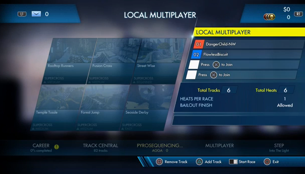
Game setup is the first screen that is seen when the player selects multiplayer.

As our group only ever plays multiplayer, we don’t know the tracks by name, and so have no interest in selecting specific ones. All we want to do is play 6 different tracks. However by default the game seems to pre-select the same track multiple times on the play list.
The process of adding and removing tracks from the playlist is cumbersome, and each track has to be selected and removed individually. The player then has to individually add each track in to the empty slots. If there was an “auto fill” option to automatically select six random tracks, that would be a closer fit to our play style.
Lastly, the icon for Start Race in the bottom corner is confusing, and takes a long time (and familiarity with the PS4 controller) to comprehend!
Bike selection
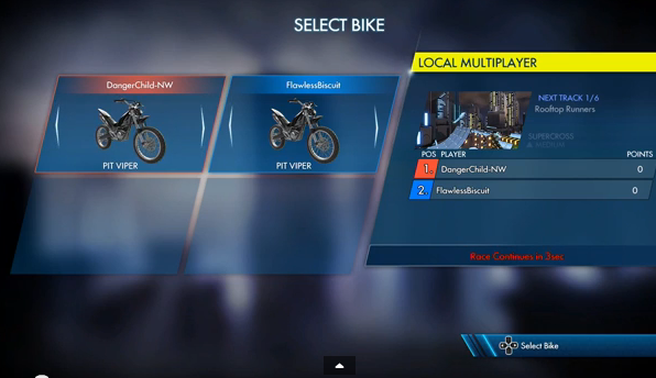
After selecting your tracks, the game asks you to pick a bike.

It would have been nice to get some information about the bikes attributes on this screen, rather than just their name – I can never remember which is the fast one. However, that is secondary to the biggest issue we’ve had with the game, and my main reason for writing this post… the hidden time limit for bike selection.
The player only has 5 seconds to pick a bike on this screen. How do I know? There is a timer on the screen (see if you can find it!). I’m not surprised if you missed it!
Having a time limit is standard for online games, but failing to communicate it to the player means that they will make accidental selections while browsing which bikes are available. This has happened to us many times while playing.
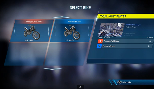
But … it gets worse! This is the bike select screen that appears after the first round:

It has a few differences to the first screen. Most crucially, the timer is gone… but the time limit remains! Now it’s even harder to pick a bike in time, as the player has no idea how much time remains. This commonly causes mis-selection of bikes.
Some up and down arrows have also appeared above the bike selection area, and only appear after the first round. I’m not sure why, pressing up and down does nothing.
The above issues don’t prevent Trials Fusion from being a fun game, and it retains the competitive charm of the previous versions. When creating games, it’s important to test the game in realistic settings. Testing it with a group of four friends playing together, who were casual fans of the series, would have uncovered these issues, and allowed the developers to fix them before it had been released to the public.
Leave a Reply