This week I have another small usability issue that would be incredibly easy to identify and fix with small scale user testing. This time it’s with Twitter on the iPhone.
Typically people read the oldest tweets first, working up to the latest ones. The app is made to support this, retaining your ‘last read’ tweet, so you can read up from there.
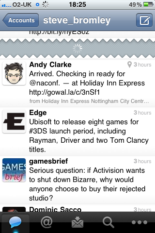
Another feature of Twitter on the iPhone is, if you’ve been away a while, your timeline will be missing entries. You’ll see a tear, like in the picture below, and clicking this will download the missing tweets into your timeline.

Downloading missing tweets...
Now the usability issue here is small but incredibly annoying. When the tweets download, you’re presented with the latest ones first, and the oldest ones at the bottom. Completely the opposite to how people use the twitter app, reading the oldest ones first. Effectively this means scrolling down a list of potentially hundreds of tweets, looking for where you were before clicking the tear (which is not indicated).
The workaround I currently use is behaviour that would be spotted straight away, and fixed, by usability testing. To prevent being taken to the most recent tweet, the user has to ‘press’ the tear, but then scroll down to hide it from view, before taking a tentative peek up the timeline after 10 seconds or so to see if the act has been successful.
User testing would quickly identify this behaviour, and make it unnecessary by fixing the problem. Instead of showing you the most recent tweet when ‘filling in the blanks’ of the timeline, Twitter should take you to the oldest, hence not breaking the user’s flow, and aligning with how the rest of the app works.
Job done!

The even bigger UX fail here is that most people have absolutely no idea that the gap can even be tapped. Last April at the Chirp conference for Twitter developers I had a chance to talk to Doug Bowman (Twitter’s Creative Director), and even HE wasn’t aware that the gap could be tapped!
Shameless plug time: I co-founded a Twitter app called TweetAgora; in addition to all the nifty filtering & aggregation stuff we do, we’ve also got a nice big obvious button in the gap area, and we load the tweets in an upward direction (configurable in Settings too).