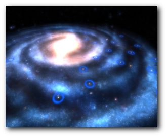
In keeping with my goal of playing popular games 2 years after everyone else, I’ve recently played through the space-action-RPG epic Mass Effect. Despite being really fun, and deserving of its 8/10 score in Eurogamer, there are some serious usability flaws in the game. Most notable of which, and the one I had the most continued trouble with, was the Galaxy Map.

You Are Here
The galaxy map is accessed from your ship, and transports you to any planet in the galaxy. Since your missions take you across far-flung reaches of the universe, it’s an area where you’ll be spending a lot of time. However while using it, I encountered multiple problems that seriously hindered it’s usability.
Firstly, and most annoyingly, was the mapping of buttons. To navigate the map, you have to zoom in and out of planets, nebulas and systems (I think? It’s all greek to me). This requires clicking on a planet on the map to zoom in, or pressing a button to zoom out. However, the mapping for these controls seems wrong.
The ‘B’ button, typically used for ‘back’ when navigating menus on the Xbox is mapped to ‘exit’ for the map screen. This means that I kept accidentally exiting the map interface when trying to navigate ‘up’ a level from a nebula to see the system. Annoyingly this meant waiting for two unnecessary loading screens, one to exit the map interface, and one to get back in!
A second issue I encountered with the map was the lack of a clear direction of where to go. Cut-scenes would often tell you the nebula to travel too, but give no indication of which specific planet. I later discovered that more detailed directions could be found on the objectives screen by opening up and viewing each specific objective, however this isn’t made clear. It also requires coming out of the map interface to find the details – again incurring more loading time penalties!
This problem could have been fixed by giving an indication of objectives on the galaxy map itself – perhaps highlighting the planets which had ongoing quest objectives open, with details of the objectives available from the same screen.
Other issues I had with Mass Effect include the micro-management of equipment such as armour and guns, including having to kit out all my party with weapons they never use (why do I carry an assault and sniper rifle if I’m only trained in pistols). This is compounded by the ‘150 item limit’ forcing me to individually select, and sell all my looted weapons, easily fixed with batch ‘sell’ options.
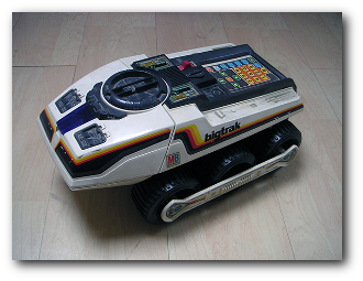
The game’s Big-trak inspired driving vehicle, the Mako, also suffered from a lack of information when presented to the player. The player is placed in the Mako, with no clear information on how to drive it. Admittedly some aspects of it are self explanatory – i.e. move the stick to go forward, but other areas (like firing the cannon with the right should pad) are left up to the player to discover. Plus it’s steering was terrible!

The Mako
Despite the concerns I’ve discussed, it’s not all bad. I enjoyed the game, and was impressed with elements such as the biotics quick-fire radial menu (although again this mechanic isn’t explained), and the dialogue trees – despite the slow, speech-heavy start! It’s just easier to criticise what’s wrong than discuss what went right (that makes for boring blog posts!). Hence I’m looking forward to playing the sequel, and hopefully finding some of the issues I’ve identified have been fixed – I’m told some of them have!
Leave a Reply