Part of a series on iPhone Game Design Issues. For an introduction see here, or use the categories on the right.
PopCap, they of Peggle and Plants Vs Zombies, commissioned a survey on where most people play mobile games. Results showed that men play more at work (28%) than women (17%). They were also asked when do they play these games. “while waiting for an appointment” came first for both genders, although I imagine this is because “on the toilet” wasn’t an option in the survey (I’m not judging… just saying!).

waiting for an appointment
What these results show is that people want mobile games to be ‘pick up and play’, and use them to fill time, as opposed to committing a large amount of time to playing them. It is therefore important that game designers facilitate this method of game playing, and make it easy to pick up and play games. The main elements of this are:
- fast start up time (from app load to actually playing)
- low number of extraneous menus to navigate before playing
- app resumes from where it left off
- app shuts down quickly, but doesn’t lose progress
A previous blog post touched on the issue of apps resuming your progress after an exit, and so this topic will focus on the user experience starting (or resuming) a game.
The player, when they start the game, wants to play as soon as possible. Initially they have to sit through a load screen, which beyond the abilities to reduce this by programming optimization is a necessary evil. However, as developers interested in ux, steps should be taken to reduce the number of steps a user has to go through after this to reach the game.
There is a trade off that has to be made here, based on our assumptions of what the user wants to do. With many types of games we can assume that the user will already be on their right profile, will want to resume a current game, or start a new game. More complex games may have a wider degree of options that they need to present the user (particularly on a first boot). So how do we decide what options the majority of users will require? More effective than experts’ ‘educated guesses’ would be qualitative testing – either through a limited release prior to the app store (I believe apple allows you to distribute your app to 100 people, enough for a good sample group), or through ‘hooks’ in the code of early releases, which will log, and send back, details on user activity. If you then found that 87% of users, on loading a game, went straight to ‘resume game’, you could make the game do this automatically, and reduce their wait.
The design of an effective ‘entry method’ into the game is incredibly well suited to large user tests, based on qualitative tests of user behaviour, and can have an enormous effect on a player’s good will and ‘feeling’ about a game. Put simply, if player’s know that they can load your game quickly, compared to one with a 30 second wait, and 5 menu screens to navigate, they are more likely to pick your game when waiting in a queue or for a meeting.
"anyone for peggle?"
Who does it well?

Textropolis
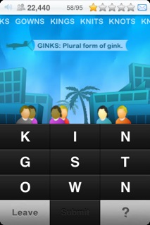
Textropolis, the word guessing game by Ian Marsh. Click on the app, and after a short load screen you’re playing the game – no menu options (obviously you can get back to the menu, but the game assumes, correctly, that most players will not need this). The nature of the game (no time crucial element), lend the game to a quick start, so this is also a fine example of a game design being suited to its platform. The game isn’t lacking in features too – the ability to sign in as separate user profiles exists, the game assumes that you will be less likely to want to do this than just play. Textropolis’ quick start up time would make this game a suitable choice for the sort of quick gaming that Popcap’s user survey says mobile gamers are into.
NB: I was going to feature Geared, the puzzle game by Bryan Mitchell here, as it loads quickly, and I cant remember having seen the title screen (it throws you straight into the game). However when writing this, I realised it doesn’t save your progress on a puzzle when you exit/re-enter, and hence it loses user experience points!
Who does it badly?

hero of sparta
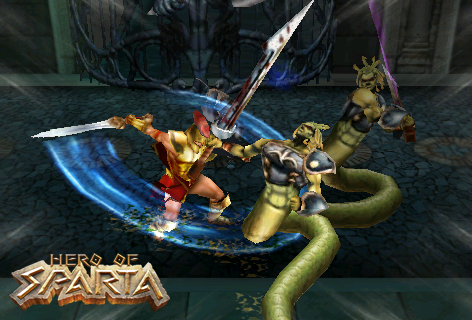
Hero of Sparta, the (rather epic) hack and slash game by Gameloft (Think those PS2 Star Wars/LOTR games).
So, we’ve got five minutes before the meeting starts, lets play. App started. A load screen, then a one minute cut scene, ok, I’ve seen it before, so I’ll skip this. Another load screen. A title screen. Touch the screen to continue, ok, I’ll do this. New game, or Continue. Obviously I want continue, so I select this. Select a chapter. Well, I’ll select the one I’ve been playing on. Great. Another load screen. And I’m in.
That’s a lot of stuff to get through between deciding I want to play, and actually getting to play. Probably one of the reasons why I haven’t devoted much time to playing this game.
How could it be improved?
After the first load, I’ll be unlikely to want to watch the opening cutscene again (despite the flashy graphics). The title screen adds needless clicking to my experience. Although I haven’t verified this with testing, I believe the player is likely to select ‘continue’ rather than ‘new game’ after they’ve started playing. And th