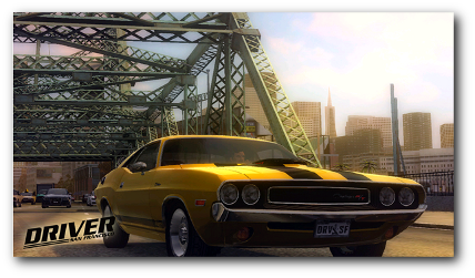
Driver: San Francisco is a new multi-platform action racer game and is part of the popular Driver series.
Unlike last weeks post, this week I’ve looked at the real usability issues (and pluses) in Driver: San Francisco. This week I’ll be looking at all the elements that create a positive player experience. Next week, we’ll be looking at the major usability issues, and what can be done to resolve this!

Driver: San Francisco
The Top 5 Positive Features of Driver
1. Shifting for mission select
Typically in games, selecting a mission is a major drag. In sandbox style games like GTA or Driver, you are required to walk to a predetermined area of the map, whereby the mission will start. This takes time, and takes the player away from the core game experience – instead it’s recreating a commute!
Driver fixes this by introducing the shift mechanic to select missions. By pressing a button at any time, the player becomes disembodied, and floats across the game world. By taking the player out of their avatar, the player is free to traverse the world at much greater speed, and reach the next mission almost instantaneously, without being taken away from the action.
2. Rapid Shift
After the first hour, the game introduces the ‘rapid shift’ mechanic. This allows the player to instantly switch between two cars under their control concurrently (the AI controls the other car when you’re not driving it).
What this means for the player is that they are never out of the action for long. Consider alternative games – crashing your car means a long pause as you reverse, change direction, and get back into the fray. Driver: San Francisco allows the player to instantly press a button, and be fired instantly back into the action.
3. Enforced Mission Variety
The missions in Driver: San Francisco have been carefully designed to elicit and demonstrate the full range of scenarios made possible by Rapid Shift. Typical driving games include very few mission types – drive fast, drive somewhere and hit something, drive somewhere without hitting something.
Rapid Shift introduces a lot of potential variety to these initial meeting types, and the mission goals are used to elicit these custom behaviours. For example, because you control multiple cars, you can ‘shift’ into oncoming traffic and cause a head on collision with your target, in order to catch them with your primary car. Another early mission asks you to finish a race in first and second place, using shifting to control both cars simultaneously.
4. Aesthetics and Setting

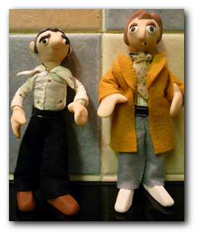
Driving cars after a coma?
Although the game’s premise is very similar to a popular BBC drama, the game isn’t set in the seventies. Despite this, the game is heavily influenced by movies and TV of the time, from the classic cars and mission types, to the car chases and the music.
Many of the missions are inspired by popular TV and films, such as Starsky and Hutch, and all these factors work together to create a ‘movie-like’ experience. By creating a complete and coherent gaming universe, Driver allows a much greater degree of player immersion.
5. Leaving drive-able zone
Just a minor usability point on this one, but I like how Driver handles leaving the edge of the world. In many rival games, the edge of the world is either a brick (or invisible) wall, or a ‘kill zone’ where the player starts to take damage after they cross a marked point.
Unlike other games, Driver has a red translucent wall depicting the edge of the game world. Driving out through this transports the player instantly to the opposite lane, coming back in to the city. This method means that the player will not take damage from leaving the game world, as opposed to hitting a wall or entering a kill zone. Additionally, players will not have to manually slow down, turn around, and come back with this method, ensuring that they are not taken away from Driver’s core game experience.
So, that is the top five features which I feel players will react positively to in Driver San Francisco. Next week, we’ll look at the five major usability issues, and what can be done to resolve them!
Leave a Reply