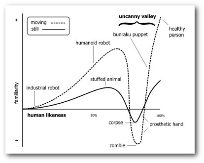
The uncanny valley is a theory describing how, as games and robotics produce more accurate representations of humanity, people’s reactions towards them are increasingly negative. This is also true with the production of wireframes, and in user experience testing and is something user centred designers need to be aware of.
The uncanny valley was originally discovered in the field of robotics, but also frequently applies to video games. It describes a phenomenon with replications of humans, whether they are life-like androids or avatars on a computer game. Initially, as the reproduction of a human and its movement becomes more lifelike we react more positively towards the object, so we’d like Lara Croft more than Leisure Suit Larry. However a point is reached, when the reproduction becomes too life-like, and the emotional response drops rapidly, meaning we feel repulsed from the object. Consider Keanu Reeves’ acting. Almost human, but utterly repulsive!
The term ‘uncanny valley’ therefore comes from plotting a graph showing our emotional response against how lifelike the reproduction is, with a sharp ‘valley’ appearing in the emotional response between a very lifelike reproduction, and the real thing.

Got that?
A similar phenomena can be seen in the production of wireframes, and hence is of critical importance to UX designers. After spending hours producing beautiful wireframes in Omnigraffle, I presented them to a client, to show how their ‘event registration’ pages would function. They came back and said “yeah it looks good, but we need to change that label text… and we need to make the dropdown arrow bolder… and can we make the heading font bigger”. This was their first view of the wireframes, to approve whether they functioned correctly, and it’s obvious what I’d done wrong.
The time and effort I’d put into making the wireframes look good, and look like a real website weren’t just wasted, they were actually hindering the process – since the mock up looked like a real webpage, the client was focusing on the small presentational details, and not the functionality itself. They expected it to look and function like the final product. If instead, I’d done a rough sketch on paper to demonstrate how the registration process should work, the client would have focused on the functionality instead. A design that looks to be in the early stages will encourage more far-reaching comments and criticism, rather than ‘fine-tuning’.
This is most important when you’re trying to focus the user experience when performing tests, especially with people not overly familiar with your site or game. Performing tests to ascertain the correct information architecture, or user’s experiences with a website’s functionality would be useless if all your comments ended up being about the site’s colour scheme. To make it clear that the designs are rough, and the presentation is not the focus, it is important not to create overly realistic designs.
Similarly care should be taken to pick an appropriate prototyping method. Paper isn’t used just because it’s quick and easy, but it also helps manage the client’s expectations. If you spent the time making the webpage on a computer, they’d be expecting it to work like a real product. On paper, this isn’t the case. Like the uncanny valley, getting too close to the real thing will be detrimental to the client’s perception of your work.

And you wouldn't want your work to look like this...
So, what steps do we need to take to ensure that the client, or user will focus on the right areas of your wireframes and designs?
- When performing initial designs, use lo-fi methods, like paper, post-stick notes, and whiteboards, where possible
- If using design software, like Pidoco or Omnigraffle, use a ‘sketches’ template, which renders your design in a pseudo-drawn method.
- Avoid drawing/designing unnecessary parts of the design – focus only on the essential
- Use filler text, and don’t work on the copy until later.
- Make it clear to the user/client that these are rough, disposable prototypes.
So, whether you’re working with a client to design their site, or conducting user testing, take care not to over-present the design, in order to manage expectations, and prevent unnecessary complaints!
Leave a Reply