This week our HCI course featured an introduction to starting the design process by evaluating existing technologies, and the key advantages of this were made apparent when we started to build paper prototypes.
In an abstract sense, the advantages of evaluating existing technology is that aids redesign – you can see what elements turned out successful, and which did not. What this means in practise is that you can steal the best bits of the competition, and fix the bits that users complain about (and hence find raw user experience data on the internet). This is particularly pertinent with this week’s release of Windows 7.
Aside from multitouch (surely useless for most home users), two of the main ‘new’ features of Windows 7 are likely to be the result of evaluating existing technologies – mainly OSX.
The task bar now has persistent icons, so they don’t go away when you close the program. Programs that are closed have a slightly different visual effect applied to them on the task bar. OSX users will of course remember this from their own Dock.
Windows 7 Taskbar

Or is it this one?
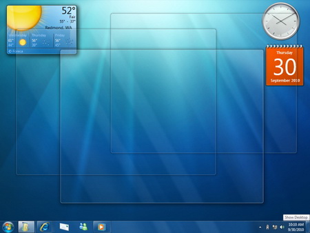
Another borrowed feature is the new way show desktop works on Windows Seven. Hover over the bottom right hand corner of the screen, and it will look like this:

show desktop
As OSX users will know, this is the same as leopards’ exposé feature, which allows users to show all open windows, all application windows, or (as in windows 7) the desktop, by moving the mouse into the corner of the screen. When I used to work on Mac’s, I thought this was a great feature, and its no surprise why Microsoft borrowed it.
Both of these are examples of taking ideas that were either popular or productive, from a rival operating system, and integrating them into your own design.
Also this week is the launch of the first Microsoft Store. Again, they evaluated the existing user experience of an Apple store (sleek design, answers bar, the layout) and… nicked it. Great success!
This isn’t just Microsoft bashing by the way, its just relevant examples of evaluating existing ideas, and taking the good bits. Everyone knows that Apple nicked all its ideas from Xerox anyhow!
So, in the spirit of ‘evaluating existing ideas’, we have been involved in the design of a new system for the University. User Experience will be important here, for the feature we are designing is likely to be used by students in high stress situations. We had half an hour to paper prototype some ideas on how to build the system (which it quickly become apparent was not enough time). Then we swapped, and compared our own designs to those produced by other groups. My personal favourite design (by Hassan and James ) had emulated key features from eBay, particularly how they categorised entries by the status (i.e. on eBay, ‘items being bid for’, ‘items I’m watching’, ‘items sold’ appear on separate lists).
This practical exercise brought home the advantages of paper prototyping, and evaluating other designs. Paper prototyping had proved to be:
- Fast
- Useful for brainstorming ideas
- Able to be changed quickly
- Adequate at demonstrating the key features of a website
and evaluating existing designs had not only helped our group find a better solution than the one we’d implemented, but also had been a key part of James and Hassan’s design process.
My ‘design gripe’ this week was my DVD player. It has many problems, a few of which I’ll share here.
- If there is no DVD in the player, it displays ‘NULL’
- The ‘time played’ counter (the default on the front of the player while playing a DVD) only counts to an hour. Then it goes back to 0 minutes again.
- The sound volume of a DVD is roughly half that of the normal audio output of the TV (and this is with the player’s DVD volume settings set to max)
- If multiple camera angles are available on the DVD, the icon for it (a little film camera) appears on the TV screen always. Its quite distracting when watching a film, and cannot be turned off. Same for if you use the ‘zoom’ functionality.
From this, we can deduce the following points:
- User experience wasn’t a priority, as ‘Null’ would mean nothing to a non-geek audience
- The player is probably intentionally badly designed, to drive the user to a higher priced one (I assume the company make more expensive ones). This may be counter productive though, as I’d be unlikely to go for the same brand.
- You shouldn’t buy the second cheapest DVD player Argos sell. (I’d hate to see the functionality of the cheapest one)

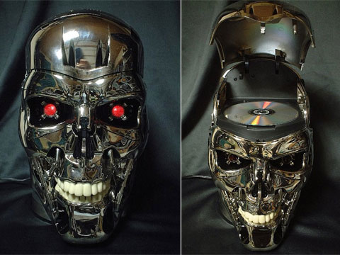
my next dvd player
I’ve started reading Alan Cooper’s The Inmates are Running the Asylum, which diagnoses the problems with technology currently as a lack of understanding by the business of the need to separate programmers and designers. Programmers are great at thinking logically, and making tools they themselves could use effectively, however they need to be given clear goals and design models by people who are better placed to understand user needs, and that is where our role as designers come in. I have to say, it’s a lot more readable than the HCI textbook, and Alan Cooper has a great degree of insight into the subject. He recounts the following (rather old) joke, which is quite relevant to our field of user experience.
He shouts down “I’m lost, where am I?”.
The man replies “You are in an airplane, 100 feet above the ground”.
After hearing that, the pilot immediately flies off, and lands successfully without a problem.
“How did you do it?” he was later asked.
The pilot replies “Well, with an answer like that, I knew I must be at the Microsoft building, and I know my way back from there”.
As we can see, the answer was true, but not helpful. This is what we want to avoid as user experience architects.
I was going to feature here the terrible user experience of Ticketmaster’s website, but I think it’s so bad it could fill an entire blog post on its own. Expect this soon (especially since I’m bitter I didn’t get my Paul McCartney tickets)!
Leave a Reply