The first lecture from Dr Graham Mcallister ( http://altclick.wordpress.com/ ) introduced us to the key aims of usability, and not just in the field of computing. Essentially, it is the art of design from a user’s perspective – and the most basic user at that. It is not enough to make software that is functional, if no-one can use it. Even usability issues that you would consider minor will dissuade people from using your product, whether it is an online shop, a ticket machine, or a computer game (as leisure activities, the success of games are particularly reliant on a positive user experience). Sam Nixon ( http://www.samuelnixon.com/ ) has shared an article which highlights the importance of good usability design, where altering just one button an a high traffic website had an immediate effect on sales – ( The $300 million button)

A less adept user
A software engineer is unlikely to be best placed to consider usability issues – they are too close to the code, and have a deep understanding of how it works. As such it can be difficult to distance themselves from their knowledge, and try the system as a new user, or one who is less adept with technology. It is therefore the job of a usability expert, using tools such as ‘voice aloud’ playtesting, and user interview to assess the usability of a system, and target aspects that need particular revision.
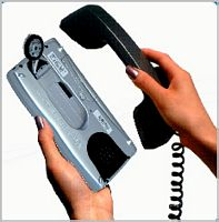
It is important to start usability testing early on in the development process of a product, and continue it throughout the lifecycle of a project. Catching issues early on will make them easier to fix than having to redesign major sections of the project at a late stage, and ignoring them altogether will may make the entire project redundant, such as with the Pocketmail
 The Pocketmail is an example of a product that went all the way to market without obviously thinking about what the users want, and how they want to use it. It gave the ability to send and receive email from a handheld device, pretty impressive for the year 2000, even if it wouldn’t fit in your pocket. The only downside being that to send and receive mail, you’d have to hold it up to a land line telephone. Oh. Surely then, you’d call the person you need to contact? Or text them? SMS was widely used by then.
But back to the HCI course. The topic seems really interesting, and something I’m genuinely interested in. As a smug iPhone user (and former employee of a Mac computer store), I’ve seen the results of year of usability refinement, and it’s a field that is both really interesting, and that has a huge amount of room to expand into. It affects every user’s experience of a product, and can be the deciding factor in whether a product succeeds, or fails miserably. Within the course we are getting the opportunity to work with the university, and a real client on delivering usability solutions, and I am really excited about this opportunity. I’m currently reading Game Usability by Katherine Isbister & Noel Schaffer – its seems a useful introduction to the field, although its authority does seem a bit diminished by the author misspelling his name, and that he seems to interview his dad.. hmm! I’ve also signed up for the UPA. Can’t wait for my new ‘designing the user experience’ poster to come through the post!
We’ve been asked to bring in examples of good and bad design for next week. The only bad example that springs to mind is craiglist – does it really need to give all that screen real estate to a list of cities/countries that a user won’t use after their first visit? Craig Newman is famously resistant to change though, so its too easy of an example (no Web 2.0 here!)
Leave a Reply